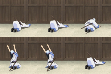
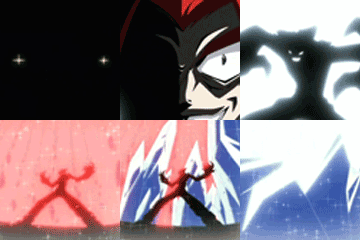
Both look LQ.
E1 : Focal needs more sharpening for depth. Render composition looks OK since the appealing part is revealed. I don't like the C4D's though , they look fine but need more blending. Although render choice is bad , the focal should have more flow. The lighting looks good. Not to mention that there is only one focal which is good and it doesn't detracts the main focus from the focal point. I like the colors , but more complimentary colors would have made the piece more appealing.
E2 : It needs more work , there isn't any basics used in there (Lighting , depth , flow , colors etc.). And the focals are disturbed , only one focal will improve the tag. Don't lower their opacity until its necessary. There also isn't much going on atm. No lighting , lighting would make this better. Instead of using plain solid colors for the background , try more darker colors since the render is a dark character.
My vote goes to entry 1.
![[Image: di-7UY7.png]](https://gfxf.net/di-7UY7.png)
Visual ftw !


![[Image: a4wguh.png]](https://i39.tinypic.com/a4wguh.png)
![[Image: m7m1t.png]](https://i40.tinypic.com/m7m1t.png)
![[Image: sci_fi_cowboys_by_xyogd-d4oe3fx.png]](https://orig03.deviantart.net/dfa1/f/2016/255/f/5/sci_fi_cowboys_by_xyogd-d4oe3fx.png)

![[Image: GD34MQu.jpg]](https://i.imgur.com/GD34MQu.jpg)


![[Image: 24b7las.jpg]](https://i44.tinypic.com/24b7las.jpg)
![[Image: 2cxasqs.gif]](https://i45.tinypic.com/2cxasqs.gif)


![[Image: kentatext.png]](https://img687.imageshack.us/img687/7734/kentatext.png)
![[Image: stormbladers.png]](https://img51.imageshack.us/img51/4111/stormbladers.png)

![[Image: orangez.png]](https://imageshack.us/a/img825/1788/orangez.png)
![[Image: 2hzgu43.png]](https://i48.tinypic.com/2hzgu43.png)


![[Image: Qwertxj3SigV1.png]](https://i1203.photobucket.com/albums/bb388/SDamonCronous/SDamonCronous%20Album%202/Qwertxj3SigV1.png)
![[Image: dragonbar_651600.png]](https://qwertxj3.dragonadopters.com/dragonbar_651600.png)


![[Image: chups3.png]](https://img705.imageshack.us/img705/9858/chups3.png)
![[Image: my-1st-animated-sig.gif]](https://i1235.photobucket.com/albums/ff438/prakhar1004/my-1st-animated-sig.gif)
![[Image: zui2a9.png]](https://i56.tinypic.com/zui2a9.png)

![[Image: di-7UY7.png]](https://gfxf.net/di-7UY7.png)
 )
)


