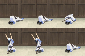
Entry 2 gets my vote.
Round 2 GFX Battle: Electric Vs Fyuuor
I vote for entry 2 because I watched one piece only 5 times and from all that I remember of those 5 episodes..entry 2 makes me feel like watching it even more...
EDIT: Electric I didnt know u never watched one piece. Well the image in entry was once the avatar of NitroNeo isnt it?
EDIT: Electric I didnt know u never watched one piece. Well the image in entry was once the avatar of NitroNeo isnt it?
(Jul. 16, 2011 8:01 AM)SAM10795 Wrote: I vote for entry 2 because I watched one piece only 5 times and from all that I remember of those 5 episodes..entry 2 makes me feel like watching it even more...I watched only the first episode before creating this image, to get used to One Peice.
EDIT: Electric I didnt know u never watched one piece. Well the image in entry was once the avatar of NitroNeo isnt it?
I had no idea the image I used was NitroNeo's avatar, I picked it up from my local renders website (Of course, anyone registered there has permission to use their renders)
-deleted- sorry for that
I vote entry 1 because it looks like a modern version of One Piece.
i'm gonna vote for entry 1
entry 2 is to bland, it has to much unused space in the sig. i know one peices style is simplistic, but i find this sig to be simple in a bad way. like what ultimate said entry 1 is a modern version of one piece, it uses the space in the sig much better. plus it looks HEAPS cooler
entry 2 is to bland, it has to much unused space in the sig. i know one peices style is simplistic, but i find this sig to be simple in a bad way. like what ultimate said entry 1 is a modern version of one piece, it uses the space in the sig much better. plus it looks HEAPS cooler

Ha, now this is exciting!
Score check:
Entry 1: 11
Entry 2: 11
Score check:
Entry 1: 11
Entry 2: 11
Can I still vote? First one please.
Entry 2. Like Kai-V said, it doesn't fit the One Piece theme very well. Although, it is very nice.
This is a tough choice. Entry one is more aesthetically appealing, but entry two does capture One Piece better. I actually wouldn't have recognized Zoro in entry one, if it wasn't for the text that says it... Theme-wise, entry two is better, but Art-wise, entry one is better.
I'm kinda stuck here; I think both entries are equal, so I'll vote for entry two, simply to help the underdog.
I'm kinda stuck here; I think both entries are equal, so I'll vote for entry two, simply to help the underdog.

Entry one please.
Woah, Everytime someone votes for entry one, someone votes for two right after, and vice versa.
The score so far is:
Entry 1: 13
Entry 2: 13
The signatures have their plus points and minus points.
The score so far is:
Entry 1: 13
Entry 2: 13
The signatures have their plus points and minus points.
I'm going to vote for.......entry two! I really does captivate the theme of one piece, I used to watch & read it regularly. I really know manga and anime themes. 

Score:
Entry 1: 13 Votes
Entry 2: 14 Votes
Entry 1: 13 Votes
Entry 2: 14 Votes
Entry 1
Votes:
Entry 1: 14 Votes
Entry 2: 14 Votes
Entry 1: 14 Votes
Entry 2: 14 Votes
Wow, a tie. Now, THIS is a competition to the end.
Just wanted to point this out, seriously I'm like wow.
Just wanted to point this out, seriously I'm like wow.
I doubt this will get any further spread than three votes. Whoever loses, you probably would have won against someone else. I'm serious, this is AMAZING.
Ooo a very crucial vote here.. Both very good entries and have some great blending. Entry one has some nice rendering while entry two blends well, the two are hard to chose from but when it comes to the theme and how the sig relates to it well my vote goes for entry two.
i will like to vote for entry 2
I'll go for
Spoiler (Click to View)
I prefer number two, simply because it represents the theme better than number one (which IS more impressive graphically).
Was the theme always One Piece, or did it change from Roronoa Zoro part way through?
If it were a battle based on Roronoa Zoro, I might choose number one, but given the theme is One Piece, I'm going for number two.
Two very even, very different entries, though interesting that both chose Zoro over One Piece as a whole, but yeah. Both of them are brilliant, though.
Entry 2 leading by 4 votes now isn't it?...really a great graphic battle between Electric and Fyuuor....whosoever will win enjoy his victory and the one who loses wont feel bad about it too..
Votes:
Entry 1: 14 Votes
Entry 2: 18 Votes
Entry 1: 14 Votes
Entry 2: 18 Votes


![[Image: reiji_v1_by_raw6319-d8qka6v.jpg]](https://orig15.deviantart.net/5944/f/2015/111/f/8/reiji_v1_by_raw6319-d8qka6v.jpg)


![[Image: my-1st-animated-sig.gif]](https://i1235.photobucket.com/albums/ff438/prakhar1004/my-1st-animated-sig.gif)
![[Image: zui2a9.png]](https://i56.tinypic.com/zui2a9.png)
![[Image: 214r3gl.png]](https://i51.tinypic.com/214r3gl.png)


![[Image: red1r.jpg]](https://img850.imageshack.us/img850/7403/red1r.jpg)
![[Image: goldy.jpg]](https://img163.imageshack.us/img163/2128/goldy.jpg)
![[Image: hero1y.jpg]](https://img35.imageshack.us/img35/9767/hero1y.jpg)
![[Image: 1zp3yoi.png]](https://i43.tinypic.com/1zp3yoi.png)

![[Image: lostseraph2.jpg]](https://i1214.photobucket.com/albums/cc494/kiluzardo/lostseraph2.jpg)


![[Image: orangez.png]](https://imageshack.us/a/img825/1788/orangez.png)


![[Image: THEKINGTAISIG.png]](https://s32.postimg.org/h1cevt2z9/THEKINGTAISIG.png)
![[Image: 1a1bfc1f08f30f84ebbe6f28c4017c7b.png]](https://i.gyazo.com/1a1bfc1f08f30f84ebbe6f28c4017c7b.png)
![[Image: Untitled.jpg]](https://i1104.photobucket.com/albums/h338/qwertxj3/Untitled.jpg) Credits to qwertxj3 for sig
Credits to qwertxj3 for sig ![[Image: TeamShadowNovaMember.png]](https://i1187.photobucket.com/albums/z390/Dracovianauis/TeamShadowNovaMember.png)
![[Image: olz5u.png]](https://gfxf.net/images/2012/08/05/olz5u.png)
![[Image: 2r2n8lu.png]](https://i54.tinypic.com/2r2n8lu.png)


![[Image: kentatext.png]](https://img687.imageshack.us/img687/7734/kentatext.png)


![[Image: UwZsp7A.png]](https://i.imgur.com/UwZsp7A.png)