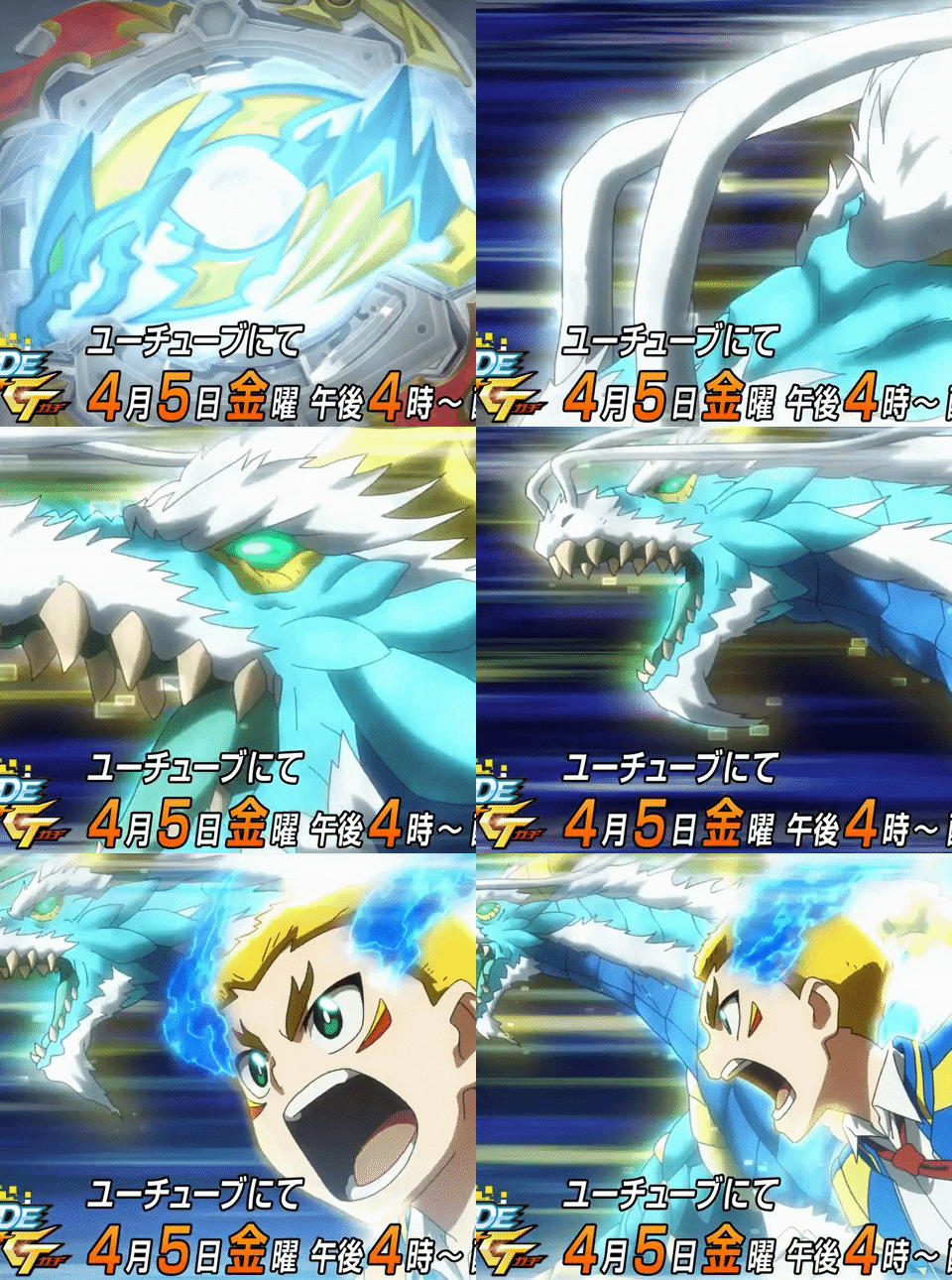
I like the way dP looks so far, the colour scheme is just so good and the design is really cool. I like the little references to dH's hexagons, the chunkier details, rounder frame and the phoenix emblem in the middle. Dare I say it looks better than rP aesthetically 
0 and At are fine I suppose, they're good parts and are now easier to access but like some people, I wish it had at least one new part (like even a new frame) since this is meant to be a major bey. It's alright I guess.

0 and At are fine I suppose, they're good parts and are now easier to access but like some people, I wish it had at least one new part (like even a new frame) since this is meant to be a major bey. It's alright I guess.


![[Image: 2hdvatw.png]](https://i64.tinypic.com/2hdvatw.png)


![[Image: IzuSiId.jpg]](https://i.imgur.com/IzuSiId.jpg)
![[Image: T5jtzGK.png]](https://i.imgur.com/T5jtzGK.png)
![[Image: NivguD4.jpg]](https://i.imgur.com/NivguD4.jpg)


![[Image: 2qs1i88.jpg]](https://i68.tinypic.com/2qs1i88.jpg)
![[Image: xckr6f.jpg]](https://i67.tinypic.com/xckr6f.jpg)
![[Image: 30j5s2f.jpg]](https://i67.tinypic.com/30j5s2f.jpg)


![[Image: beybase-signature-is-beyblade-a-sport-Article.jpg]](https://i.postimg.cc/VLksgt2k/beybase-signature-is-beyblade-a-sport-Article.jpg)
![[Image: sdmLGU9.jpg]](https://i.imgur.com/sdmLGU9.jpg) LET IT RIP!!
LET IT RIP!!![[Image: Tjyd51g.jpg]](https://i.imgur.com/Tjyd51g.jpg)
![[Image: DvLELngUcAEf-wJ.jpg]](https://pbs.twimg.com/media/DvLELngUcAEf-wJ.jpg)
![[Image: ExcellentImpassionedBagworm.webp]](https://thumbs.gfycat.com/ExcellentImpassionedBagworm.webp)

![[Image: 4904810618522_479be8d0af4d4859a9177d08701964ea.jpg]](https://dmwysfovhyfx3.cloudfront.net/img/goods/5/4904810618522_479be8d0af4d4859a9177d08701964ea.jpg)