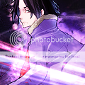
Entry 1 the background makes the character stand out, and has a nice feel and the blending of the brushes seem good, it also seems as if shes in a spot light. But there is some random block of black on the far right side of the tag.
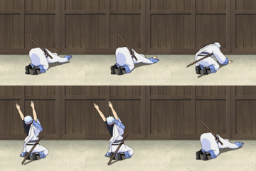
Entry 2 the background seems completely random at first, but after looking at it for a few minutes, you seem to see more stuff looks as if there is a water fall, and a river with a tree bending over it... Naruto seems slightly pixelated and doesn't seem to go with the background, I don't really like the text in this tag...
My vote goes for Entry 1.
![[Image: sci_fi_cowboys_by_xyogd-d4oe3fx.png]](https://orig03.deviantart.net/dfa1/f/2016/255/f/5/sci_fi_cowboys_by_xyogd-d4oe3fx.png)

 . Bring it on Xyo !
![[Image: di-7UY7.png]](https://gfxf.net/di-7UY7.png)


![[Image: GD34MQu.jpg]](https://i.imgur.com/GD34MQu.jpg)

![[Image: Septentrionecopy_zpscc356516.png]](https://i1173.photobucket.com/albums/r593/DeusXiphos/Septentrionecopy_zpscc356516.png)
![[Image: my-1st-animated-sig.gif]](https://i1235.photobucket.com/albums/ff438/prakhar1004/my-1st-animated-sig.gif)
![[Image: zui2a9.png]](https://i56.tinypic.com/zui2a9.png)


![[Image: 33w7cpl.gif]](https://i51.tinypic.com/33w7cpl.gif)
![[Image: dragonbar_640522.png]](https://callum6939.dragonadopters.com/dragonbar_640522.png)


![[Image: shadowsig1.png]](https://imageshack.us/a/img194/8892/shadowsig1.png)
![[Image: 89593399.png]](https://imageshack.us/a/img443/1286/89593399.png)

![[Image: a4wguh.png]](https://i39.tinypic.com/a4wguh.png)
![[Image: m7m1t.png]](https://i40.tinypic.com/m7m1t.png)


![[Image: MakaxSoul-1.png]](https://i1083.photobucket.com/albums/j381/ToKaoWBO/Signatures/MakaxSoul-1.png)

![[Image: olz5u.png]](https://gfxf.net/images/2012/08/05/olz5u.png)


![[Image: flamingarieshalo.png]](https://i1131.photobucket.com/albums/m560/WBOFlamingAries/flamingarieshalo.png)
![[Image: L7aE8.png]](https://i.imgur.com/L7aE8.png)

![[Image: 15cects.png]](https://i56.tinypic.com/15cects.png)

![[Image: tsubasa_futomos_sig.png]](https://box44.fr/beyblade/sig/tsubasa_futomos_sig.png)


