General GFX Thread
![[Image: 9a8c164.jpg]](https://i.imgsafe.org/9a8c164.jpg)


Been awhile since I went into this thread (Actually, to this forum. I think I was inactive for 2 years? I'm not really sure)
Im just here to update my sig and avi, and of course ask for some CnC, for old time's sake:
Adios~
Im just here to update my sig and avi, and of course ask for some CnC, for old time's sake:
Spoiler (Click to View)
![[Image: GD34MQu.jpg]](https://i.imgur.com/GD34MQu.jpg)


(Oct. 22, 2015 3:21 PM)Synth Wrote: Been awhile since I went into this thread (Actually, to this forum. I think I was inactive for 2 years? I'm not really sure)Ayeeee!!!!!!! Tsuna as my username for a while lol.
Im just here to update my sig and avi, and of course ask for some CnC, for old time's sake:
Adios~Spoiler (Click to View)
But great job Synth! Love the colours and smudging, 10/10.


Well, it should be "Mess with the best, Die with the rest" 
![[Image: f759d58.gif]](https://i.imgsafe.org/f759d58.gif)
![[Image: rcFJUxo.png]](https://i.imgur.com/rcFJUxo.png)


Even then, it's not proper English dude. I'd fix it, personally.
It's OK, but it's also pretty LQ. The text isn't fitting for the mood you were trying to set, either.
It's OK, but it's also pretty LQ. The text isn't fitting for the mood you were trying to set, either.


Cnc?
(Also, I gave Leone7 the permission to use this in case he ends up doing so)
(Also, I gave Leone7 the permission to use this in case he ends up doing so)
![[Image: 20af95v.png]](https://i61.tinypic.com/20af95v.png)
![[Image: 29c0thl.png]](https://i60.tinypic.com/29c0thl.png)
Attached Files
Thumbnail(s)
[Image: KiritoSig_zpswx5txvoe.png]
After seeing Kujikato's sig, I was inspired to a SAO (Since it is my favourite anime) piece. Feel free to CnC
After seeing Kujikato's sig, I was inspired to a SAO (Since it is my favourite anime) piece. Feel free to CnC
The text is too blended, I don't undersrand what the circles are there for, they don't add anything to the piece.
Something I like is the focus and clarity of the render.
Something I like is the focus and clarity of the render.
(Nov. 06, 2015 4:19 AM)BUMP KING Wrote: The text is too blended, I don't undersrand what the circles are there for, they don't add anything to the piece.I thought the circles added to the piece. guess not xD. But thanks! Definitely will make things better in my next piece.
Something I like is the focus and clarity of the render.


Circles in the vector sense coupled with clipping masks makes for really nice effects.
If anything I'd say the render isn't blended at all. Central focals are generally to be avoided. Text is indeed overblended and badly placed as well. On top of that, the background is kinda eh. It's really LQ.
If anything I'd say the render isn't blended at all. Central focals are generally to be avoided. Text is indeed overblended and badly placed as well. On top of that, the background is kinda eh. It's really LQ.
![[Image: kiritoxasua_tag_1_crop_awesome_by_kujikato-d8mkgbh.png]](https://orig08.deviantart.net/b598/f/2015/080/f/6/kiritoxasua_tag_1_crop_awesome_by_kujikato-d8mkgbh.png)
[Image: avatar_80407.png?dateline=1449182428]
[Image: Mitsushidosig1.png]
I was super happy with the outcome of these! What do you guys think?
[Image: Mitsushidosig1.png]
I was super happy with the outcome of these! What do you guys think?


Looks good I like the shades of blue you used. Reminds me of a tropical sea.
Dunno that akneemay, tho
I like the shades of blue you used. Reminds me of a tropical sea.Dunno that akneemay, tho
![[Image: ZikXJUg.jpg]](https://i.imgur.com/ZikXJUg.jpg)
The color thematic is sooooo sick, haha. Love it.
It's a clean and simple piece that works really well with the whole aesthetic of the blue name It isn't graphically mindblowing but it fits really well for what I perceive as your needs. gj gj
It's a clean and simple piece that works really well with the whole aesthetic of the blue name
It isn't graphically mindblowing but it fits really well for what I perceive as your needs. gj gj


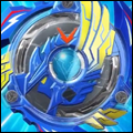
Could someone possibly resize this image for me to fit within 500x200 px or smaller? I don't want it stretched out or anything. I'd do it myself but mobile is a pain. Feel free to crop it if need be to be more rectangular. Just make sure the beyblade is the focal point. A png over a jpeg would be nice as well
[Image: nezSlzY.jpg]
@[Mitsu]
[Image: nezSlzY.jpg]
@[Mitsu]


WOW!!! That is very nice Tri
Unless your using it to advertise, that's a weird place for a watermark. 
i like it a lot it must have taken quite a long time.
aaand I ended up updating it cause colors.
@[DRAGON KING EX] watermark is DeviantArt generated to prevent plagiarism
@[the huge winner] with practice you cut down the time needed to make things like that
Silhouette Aura (Click to View)
@[the huge winner] with practice you cut down the time needed to make things like that
I'm probably going to end up switching to Photoshop very soon. Online editors can be versatile and I've seem to pull through with them this past while, but Photoshop should offer quite a bit more. What do you guys think about these, in the meantime?
Spoiler (Click to View)


(Jan. 10, 2016 11:23 PM)Mitsu Wrote: I'm probably going to end up switching to Photoshop very soon. Online editors can be versatile and I've seem to pull through with them this past while, but Photoshop should offer quite a bit more. What do you guys think about these, in the meantime?
Spoiler (Click to View)
Yeah, you'd definitely want to switch to photoshop sooner or later. It opens up a lot more features that makes your workflow a lot more easier. I feel like in the first one, if both xcalibur and wyvern were both top down, it'd look a lot better. In it's current state, it feels unbalanced and gives off a low quality vibe to it. The text and drop shadow in the second one just reek with edges, and would look a lot slicker if the text was smoothened out - which is solved when you switch over to photoshop regardless.
![[Image: 7678.png]](https://cdn.discordapp.com/attachments/513941232419078157/599118897811030027/7678.png)
(Jul. 17, 2016 5:24 AM)Kujikato Wrote: Geeeeee this thread is so dead. But well, new work
IKR? Anyways, got a new work as well
Spoiler (Click to View)
![[Image: GODYR.png]](https://s32.postimg.org/uwc0tj1ph/GODYR.png)