


Very nice work, for sure. 
Personally not the biggest fan of the web or the background being blurred though.
Personally not the biggest fan of the web or the background being blurred though.
(Jul. 16, 2015 7:47 PM)Nisshoku Wrote:(Jul. 16, 2015 3:02 PM)Favourite Wrote: Ok, maybe I DID act rude. I'm sorry but you SHOULD have mentioned SOMETHING regarding you being unable to write.This is way off topic. Please take this to the PM'S.
(Sorry for backseat moderating)
Anyway,One of my latest pieces
[Image: Untitled-1_zpsdeaef4f4.png]
(Aug. 26, 2015 3:19 PM)Hato Wrote: @[Shido-Kun] I would say try to make everything in the background not blurred,but just having a far away look. I see some parts of the background are blurred so that's why I'm saying this.I'm not sure if it's just you, but for me the background isn't blurred at all.
Also, just personal preference; not to fond of where the name is.
(Aug. 26, 2015 3:30 PM)Shido-kun Wrote:(Aug. 26, 2015 3:19 PM)Hato Wrote: @[Shido-Kun] I would say try to make everything in the background not blurred,but just having a far away look. I see some parts of the background are blurred so that's why I'm saying this.I'm not sure if it's just you, but for me the background isn't blurred at all.
Also, just personal preference; not to fond of where the name is.
You think so? Maybe I should ask her to redo the text. Is there nothing good to complement on?
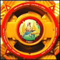
(Sep. 01, 2015 8:08 PM)Hato Wrote: New to GFX and made this:
The yellow bar is where I put the name.Spoiler (Click to View)
CnC please?
(Sep. 01, 2015 9:00 PM)Shirayuki Wrote:On the program's I'm using, it doesn't have many effects; nothing fancy like blur.(Sep. 01, 2015 8:08 PM)Hato Wrote: New to GFX and made this:
The yellow bar is where I put the name.Spoiler (Click to View)
CnC please?
While it definitely isn't bad, it just seems a little too monotonous. The yellow bar could definitely be implemented better, but I can't quite think of a better way to do it. It's a little hard for me to comment on tags like these, because they push towards the minimalistic aspects of GFX in general, while I'm more used to the effect spam with ridiculous lighting.
Overall, it serves it's purpose, and it could definitely be better, but the tag itself just seems a little empty and soulless.
(Sep. 08, 2015 9:13 PM)Hato Wrote:(Sep. 08, 2015 9:01 PM)Flame~Capricorn Wrote: Could someone please make me both an avatar and signature? Omega dragonis and it's owner please. Thanks!
...
This is what your friend the OP Wrote:NOTE: This thread is not for requests, only for sharing your creations and recieving consultation!
Was real happy with the outcome overall!(Oct. 14, 2015 2:11 AM)Mitsu Wrote: [Image: yosh.png]I love it, Very minimal but at the same time it pops
Another change to my osu! userpage.
What do you guys think?


![[Image: kiritoxasua_tag_1_crop_awesome_by_kujikato-d8mkgbh.png]](https://orig08.deviantart.net/b598/f/2015/080/f/6/kiritoxasua_tag_1_crop_awesome_by_kujikato-d8mkgbh.png)


![[Image: S312-Illust19.jpg]](https://i.postimg.cc/KcNj6qX2/S312-Illust19.jpg)


![[Image: 7678.png]](https://cdn.discordapp.com/attachments/513941232419078157/599118897811030027/7678.png)

![[Image: 9a8c164.jpg]](https://i.imgsafe.org/9a8c164.jpg)