
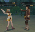
Woah, ENTRY 1 gets my vote. Specail effects.. ENTRY 2 was still pretty good though!
Grand Final GFX Battle: Omega Vs Fyuuor
![[Image: Qwertxj3SigV1.png]](https://i1203.photobucket.com/albums/bb388/SDamonCronous/SDamonCronous%20Album%202/Qwertxj3SigV1.png)
![[Image: dragonbar_651600.png]](https://qwertxj3.dragonadopters.com/dragonbar_651600.png)


I like entry 1.
it's more exciting, and entry 2 being flat just loses personality imo.
it's more exciting, and entry 2 being flat just loses personality imo.

i vote for entry 1 entry 2 is also good but entry 1 is more colourfull and nice!
![[Image: a4wguh.png]](https://i39.tinypic.com/a4wguh.png)
![[Image: m7m1t.png]](https://i40.tinypic.com/m7m1t.png)


im going with no 2. it's more like the comic book and fits the caracter more. no 1 makes gambit look evil witch, unless i havent read enough about him, i know isn't. this is close, im surprised there isn't more votes for no 2, they should be very even on votes.


Score check!
Entry 1: 19
Entry 2: 3
Entry 1: 19
Entry 2: 3
![[Image: red1r.jpg]](https://img850.imageshack.us/img850/7403/red1r.jpg)
![[Image: goldy.jpg]](https://img163.imageshack.us/img163/2128/goldy.jpg)
I vote entry 1, it seems more shifty (thats good!), real and actually modern. I also like background and the render is awesome
![[Image: 1SD03.png]](https://gfxf.net/images/1SD03.png)
![[Image: bhj76s.png]](https://i51.tinypic.com/bhj76s.png)
hey people the tables might change anyway my vote goes to entry 1 its very colorful
![[Image: 85495087.jpg]](https://imageshack.us/a/img43/8923/85495087.jpg)


I vote for entry 1, I like the use of C4D's and the brightness is nice. Entry 2 just looks a bit dark and the render isn't excellent quality. But, it is still great!
But I vote entry 1.
But I vote entry 1.
![[Image: RQQeW.png]](https://i.imgur.com/RQQeW.png)
Both are great but I prefer the picture of Gambit in Entry 2.
So my vote goes to Entry 2!
So my vote goes to Entry 2!
![[Image: 2r2n8lu.png]](https://i54.tinypic.com/2r2n8lu.png)
Entry 1 gets my vote. It has great depth along with a great background.
Entry 2 is a bit too simple.
Entry 2 is a bit too simple.
![[Image: 9tg8qc.png]](https://i56.tinypic.com/9tg8qc.png)
1. definetly.
![[Image: JCx06-Driger.jpg]](https://content.screencast.com/users/justin.chung/folders/Default/media/af847311-67cf-47b3-97b1-0b13d00c1ab7/JCx06-Driger.jpg)


JCx06 please elaborate and then I will count you vote
Score check!
Entry 1: 23
Entry 2: 4
Score check!
Entry 1: 23
Entry 2: 4
![[Image: flamingarieshalo.png]](https://i1131.photobucket.com/albums/m560/WBOFlamingAries/flamingarieshalo.png)
![[Image: L7aE8.png]](https://i.imgur.com/L7aE8.png)


(Aug. 31, 2011 11:25 PM)Flaming Aries Wrote: Entry 2: I will start with the render I actually really like the placment of it and love how the artist scaled it and showed the whole background. Moving on the right is brilliant and I love the brown part of his coat with all the depth and texture of it, the card is also absolutely awsome and don't even get me started the color my whole post could be exactly on how brilliant that card is lets just say you would ge bored when you started. The purple background is hands down one of the best ever and I love the little shooting beams they are downright awsome! The text is also great however this is problably the only thing about the signature that should be changed so it is a layer over the beams and it should be a bit brighter but still it is awsome. Also I love the color of the border and how big it is don't be afraid to make a big border. This is really great I love the placement, colors, depth, texture, and style.
10/10
I really think that we have to think about what looked like it had more hardwork, creativity, and thought put into it.
I really tihnk Entry 2 did put hardwork, creativity, and thought and of course this great artist deserves not only my vote but his position in the Grand Finals.
Entry 2 Congrats!
You seem to be way too sickly obsessed with a lot of banal elements in that signature picture. You want to make love with that card or something ? I do not even say things like that about Dir en grey, so you have a problem.
Sorry if I was sounding corny I just really liked it I am not hands down gonna just vote because of that that was only like 10% percent of the sig and I really liked all of it. You can vote if you like.

Come on people, this thread needs more votes!!!
![[Image: orangez.png]](https://imageshack.us/a/img825/1788/orangez.png)
Entry 1 because I like all the colours everywhere.
![[Image: stormbladers.png]](https://img51.imageshack.us/img51/4111/stormbladers.png)
Please everybody, we need more votes! This is the Grand Final and will crown the champion of the GFX Tournament from the winner of this match. If you haven't already voted, please vote!
Score check!
Entry 1: 24
Entry 2: 4
Score check!
Entry 1: 24
Entry 2: 4


I vote for Entry 1. I think it had a little bit more effort put into it, and it's more appealing to my eyes than entry 2.
![[Image: 517400330-1.jpg]](https://i1212.photobucket.com/albums/cc453/LuminoDharak/517400330-1.jpg)

I vote for entry one. Gambit actually looks a bit scary and the overall look is really awesome. Entry 2 is also good, but seemed kinda rushed (Don't know if it's the case and don,t really care, either)
![[Image: dudehailsignature.jpg]](https://i800.photobucket.com/albums/yy281/BaroqueRosso/dudehailsignature.jpg)

entry 1 for sure, entry 2 looks a little to comic book for me. if you guys really need more votes why don't you pm everyone to vote, maybe that would help.
Eh, Gambit IS a comic book character, y'know. Just pointing this out, though everyone is allowed their own opinion.


I vote for Entry 2. I personally don't like the way 1 is out together. I'm not a big fan of that type 
![[Image: chups3.png]](https://img705.imageshack.us/img705/9858/chups3.png)
Score check!
Entry 1: 27
Entry 2: 5
Entry 1: 27
Entry 2: 5
I vote entry one, the whole look of entry 2 really doesn't appeal to me. Entry 1 looks like a lot more time had been put into it also I prefer the style of it overall.