General GFX Thread

(Jan. 18, 2013  7:30 PM)Wombat Wrote: I'm pretty new to GFX, so mine aren't that good. Any suggestions on what I could do to make them better?
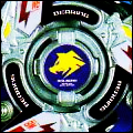
This is a "banner" I made for Beyblade Colosseum:
Could I get some CnC on both that and my signature?

The effects, are ugh... anyhow, there is no focal, and the renders are like, translucent, which makes it somewhat worse.
I haven't made anything in a while, so here is something ...

[Image: mudkip_tag_by_zaneified-d5rxjs5.jpg]

I don't really want a consultation since it's not that good, but go ahead if you want.
Well I made this for Focus and yes I was really rushing while doing this so I guess the smudge didn't turn out well.....CnC?
[Image: FocusGift_zpsf7c4762e.png]
Smudge is not that good. White smudge is a fail. Lighting is great! Flow is not coming through.
Good try!! You're getting better!! KIU!!
Dunno what the deal was with this. CnC, I guess.

Ha, I'm too lazy for the WLPaA
No blending.
render is too tiny.
the red thing causes the flow.
no depth lighting or compo.
Try other stuff. Seen better from you
Could someone render this for me?

http://onlyhdwallpapers.com/wallpaper/me...48556.jpeg

It has to be extremely neat, I've attempted it myself but the shadows always mess it up for me, thanks.
(Jan. 19, 2013  6:37 PM)Medz Wrote: Could someone render this for me?

http://onlyhdwallpapers.com/wallpaper/me...48556.jpeg

It has to be extremely neat, I've attempted it myself but the shadows always mess it up for me, thanks.

For some reason it doesn't show with me, but is it a logo ?

EDIT: I just Googled the link and this appeared :
So, is it that ?
(Jan. 19, 2013  7:20 PM)Kaizer Vearn Wrote:
(Jan. 19, 2013  6:37 PM)Medz Wrote: Could someone render this for me?

http://onlyhdwallpapers.com/wallpaper/me...48556.jpeg

It has to be extremely neat, I've attempted it myself but the shadows always mess it up for me, thanks.

For some reason it doesn't show with me, but is it a logo ?

EDIT: I just Googled the link and this appeared :
So, is it that ?

It came up with that for me too.
I'd assume that's the right one, I can see how the shadows could "mess it up"
Yeah that's the one, it's for the logo in my game.
(Jan. 19, 2013  10:45 PM)Medz Wrote: Yeah that's the one, it's for the logo in my game.

OK, here you go :

(Jan. 20, 2013  9:56 AM)Medz Wrote: Thanks a lot! Really appreciate it.

No problem, glad to help.
Yo, Please can someone render this so that all you can see is the actual FireBlaze logo? None of the yellow hexagon should be seen. Thanks in advance. Please can you PM it to me because I am a bit forgetful and I would probably forget to check this thread. [Image: BurnFireblazeMotif.PNG]
(Jan. 20, 2013  6:24 AM)Kaizer Vearn Wrote:
(Jan. 19, 2013  10:45 PM)Medz Wrote: Yeah that's the one, it's for the logo in my game.

OK, here you go :


Nice work Kaizer :3
I could never do something even half as decent as that !
(Jan. 20, 2013  1:13 PM)Luck Wrote: Nice work Kaizer :3
I could never do something even half as decent as that !

Haha thank you very much ! ^^
(Jan. 20, 2013  2:04 PM)Kaizer Vearn Wrote:
(Jan. 20, 2013  1:13 PM)Luck Wrote: Nice work Kaizer :3
I could never do something even half as decent as that !

Haha thank you very much ! ^^

No problem, I think that the shadows are just perfect Smile
He got rid of the shadows, hah.

*he hates me*

A poster I did for a teacher in School. Twas a quickie. WARNING: Super Duper Duper Large Image. Use URL for safety (Click to View)
URL: http://i.imgur.com/TYiIitb.jpg
Can anybody help me with backgrounds? I suck at them.
(Jan. 20, 2013  1:13 PM)Luck Wrote:
(Jan. 20, 2013  6:24 AM)Kaizer Vearn Wrote:
(Jan. 19, 2013  10:45 PM)Medz Wrote: Yeah that's the one, it's for the logo in my game.

OK, here you go :


Nice work Kaizer :3
I could never do something even half as decent as that !
I agree with him. It is pretty good, I also like the anime and game behind Grin If you try to perform the shadow it can be perfect!
Can anyone CnC on these two?

[Image: Untitled-4-6_zpsea4f9956.png]

[Image: Untitled-1-17_zps126ed6eb.png]
The first one is too bright. It would be great as a background, but like that, no Smile

The 2nd one has potential, but is too monochromatic. If you use a larger canvas, and read some tuts, your somewhat seeable GFX abilities will get you going! KIU!

CnC on my new explosion
[Image: betWvH0.png]
Flow is great!
Text is fine but sorta spoils the flow
Overall a great new tag and style!
The text's effects compliment the flow greatly, if you note the two lines behind the text, it provides more flow.

Argument InVaLiD. Thanks for the CnC anyway Grin
So, you ask for a CnC but then immediately try to shoot it down when someone gives you one?

Right.