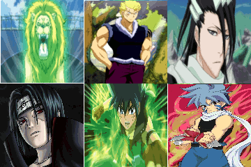
Round Two - Block A - [ChinaBlade vs. Viral]
Poll: My vote goes to ...
| Entry A |
|
5 |
| Entry B |
|
27 |
| Total: | 100% | 32 vote(s) |
I vote for B. The render and backround and nice and it has more flow.
Entry A: No Blending or Flow or Depth. Text is way too distracting
Entry B: Love the colour Scheme and Composition!
I'm not a fan of either....
Neyh.
Saw my name and freaked again.
Neyh.
Saw my name and freaked again.
I think B is a bit too bright. But A doesn't blend well. I vote for A
B follows more basics, in my book, so it get's my vote. Love both though!
B catches my eye more than A
so it gets my vote
so it gets my vote
They both look like they were worked on a lot. But I have to stick with B.
B has more.... blend, I think. They both look good, but B has that scheme that gives it the edge over A.
I vote for B, I don't really like the colours or text in A... :L
B got this one. I can immediately tell who's who, and B just has what's better... Also, that pixel-y stuff threw it off again...
B has my vote
it has a nice color scheme
it has a nice color scheme
I vote B Because the render matches the smudge what he did and the color scheme. Great job
A uh... Render and Background doesn't really match at all so yeah :l
A uh... Render and Background doesn't really match at all so yeah :l
Since battle 2 hasn't ended, why not give the thread a bump to continue the voting.
Voting has not ended yet!
Vote while you can!
Voting has not ended yet!
Vote while you can!
Entry A: No blending at all, justa background with a render placed on tip of it and some fancy text on the other side of the world which destroys the focus...
Entry B: Good blending and colour scheme, although the text could have been more flowing and its a bit too bright.
Why is the render smack-bang in the midlle?
I guess my vote goes to B...
Entry B: Good blending and colour scheme, although the text could have been more flowing and its a bit too bright.
Why is the render smack-bang in the midlle?
I guess my vote goes to B...


![[Image: gPp4aQW.png]](https://i.imgur.com/gPp4aQW.png)


![[Image: YM8un.png]](https://gfxf.net/images/2012/11/19/YM8un.png)
![[Image: GengarSig1ver1_zpsbc815ce3.png]](https://i1348.photobucket.com/albums/p721/ThatDaftHetalian/GengarSig1ver1_zpsbc815ce3.png)


![[Image: mb6y2H9.png]](https://i.imgur.com/mb6y2H9.png)


![[Image: kiritoxasua_tag_1_crop_awesome_by_kujikato-d8mkgbh.png]](https://orig08.deviantart.net/b598/f/2015/080/f/6/kiritoxasua_tag_1_crop_awesome_by_kujikato-d8mkgbh.png)

![[Image: tumblr_mdwt2mJhTd1rkl9uao1_500.png]](https://25.media.tumblr.com/tumblr_mdwt2mJhTd1rkl9uao1_500.png)
![[Image: 381969_281635805289035_680655438_n.jpg]](https://sphotos-a.ak.fbcdn.net/hphotos-ak-snc7/381969_281635805289035_680655438_n.jpg)


![[Image: Wd8Ug.png]](https://i.imgur.com/Wd8Ug.png)


![[Image: 8r5n.jpg]](https://imageshack.com/scaled/large/41/8r5n.jpg)
![[Image: jfXbe.jpg]](https://gfxf.net/images/2012/07/13/jfXbe.jpg)