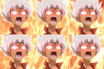
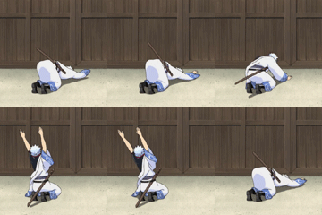
the pictures are way to expanded. try to fix that
BEYBOOST323's signature store
Poll: HOW'S MY SIG I MADE FOR YOU?
| GOOD |
|
0 |
| NOT BAD |
|
6 |
| EXCELLENT |
|
1 |
| Total: | 100% | 7 vote(s) |
They look stretched, so the images in them look out of proportion. Unless your screen is set up wrong, that kinda thing looks pretty bad.
(Jul. 24, 2011 12:59 PM)th!nk Wrote: They look stretched, so the images in them look out of proportion. Unless your screen is set up wrong, that kinda thing looks pretty bad.
hmm... i know but when i reduce its width it looks more bad like my sig and i dont think that the screen is setup s wrong i dont think they look bad even when i reduce its width they look bad i have tried this all u told but

Sorry, I think we've misunderstood each other. Just try not to alter the width of an object in the signature without altering it's height by the same scale. Photoshop has tools for this, but when manually resizing an object, hold the shift key if you're dragging a point to resize it, or check "constrain proportions" or "maintain ratio" in the resize box (I forget which it's called).
If someone can make this clearer for me, please do. DeX?
If someone can make this clearer for me, please do. DeX?
i dint understand any word of it and you will be surprised but i jst know 5 or 6 tools of ps cs4 and i work with them i cant make it clearer because once i have posted the pic then i never modifi it
we got Image resize for a reason. what you did is a horribly thing to do: expanded the pictures even do it is already cool enough to look at. you think its cool? well FYI, its not. your cutting needs fixing, as there are too many Renders of yours that has really weird formations in their hair, and other parts of their body. plus learn some tutorials! you need to learn how things work properly.
(Jul. 24, 2011 1:12 PM)BEYBOOST323 Wrote: i dint understand any word of it and you will be surprised but i jst know 5 or 6 tools of ps cs4 and i work with them i cant make it clearer because once i have posted the pic then i never modifi it
Eh, tbh I'm not that surprised. Might I suggest learning a bit more before you make signatures, then?
There are loads of free photoshop tutorials on the net, and once you've learnt the ropes, http://www.sigtutorials.com/ looks like it has a bunch of handy tutorials for makin' 'em real fancy-like.
i am new in sig making i have not completed a month from making sig's i am going to practise more and more
Hold down shift when you resize images in Photoshop, it keeps the proportions the same
Thank god I told you to make a sig...otherwise you would have been blamed a lot...BEYBOOST u r a learner so first learn sig making well and then make 2-3 awesome sigs like those of Xlr8 and Fyuuor..that will make you get more and more people to your sig. shop
Your cutting on the Kyoya in the first example is horrible.
I wish i have PS CS4 like you had if i did my sigs would look better, anyways Kai is too squashed and the pics are blurry.
then get the software
and make sig's
and make sig's
i have added an example of my work as all of you wish!
opened again !! with improved skills!!!
THREAD OPENED AGAIN! see the full thread again!! new examples,new skills too...
They're so blurry, as people have stated before. Also, it seems the images have been squashed and smashed out of proportion.
Also, your cutting could use some work.
Also, your cutting could use some work.


![[Image: GD34MQu.jpg]](https://i.imgur.com/GD34MQu.jpg)

![[Image: a4wguh.png]](https://i39.tinypic.com/a4wguh.png)
![[Image: m7m1t.png]](https://i40.tinypic.com/m7m1t.png)


![[Image: UwZsp7A.png]](https://i.imgur.com/UwZsp7A.png)
![[Image: Support.png]](https://i4.photobucket.com/albums/y133/snakebite182/Support.png)


![[Image: eminemsignew.png]](https://i1121.photobucket.com/albums/l505/spartandranzer/eminemsignew.png)
![[Image: sci_fi_cowboys_by_xyogd-d4oe3fx.png]](https://orig03.deviantart.net/dfa1/f/2016/255/f/5/sci_fi_cowboys_by_xyogd-d4oe3fx.png)