BeybladerPotter Wrote:Gee, there is soo much entries that we might have to do vote for two don't you think?
Just though I would correct some of that for you:
SDamonCronous Wrote:Gee, there are soo many entries that I think we might have to do vote for two; don't you agree?
Sorry, I'm just excessive compulsive

I know I can't vote, but I will give a comment anyway:
Entry 1: Really nice, good lighting. I like the quality of the render and the backgroud, they both work well together
Entry 2: Quite basic, the render is not blended well enough and IMO the purple lightning looks bad in front of the render, it distracts you too much.
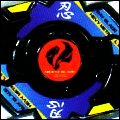
Entry 3: I know who's this is (just saying) just from looking at it. Nice blending and use of colours, it is just a bit light though
Entry 4: This is probably the one I would vote for if I was allowed. Nice and clear, I like the effect on the gun and it flows well.
Entry 5: Text is great, I like the background but I think the render if just a bit... off. the sleeve cuts out near the writing and that ruins it. But nice effects and obviously a lot of work went into it.
Entry 6: This one is quite simple, nice render and text but I hate how they put the render behind the effects, it totally ruins the flow of the sig. Remember, the render is the center of the sig, covering it up makes that effects the focus and that is a no-no.
Entry 7: I like the colour scheme, a consistent gold-ish tone. The lighting isn't great though, the light is shining, then shadow then light on the opposite side of the render's face? Nice text placement and effects though.

![[Image: 1zp3yoi.png]](https://i43.tinypic.com/1zp3yoi.png)


![[Image: GD34MQu.jpg]](https://i.imgur.com/GD34MQu.jpg)


![[Image: kiritoxasua_tag_1_crop_awesome_by_kujikato-d8mkgbh.png]](https://orig08.deviantart.net/b598/f/2015/080/f/6/kiritoxasua_tag_1_crop_awesome_by_kujikato-d8mkgbh.png)


![[Image: sci_fi_cowboys_by_xyogd-d4oe3fx.png]](https://orig03.deviantart.net/dfa1/f/2016/255/f/5/sci_fi_cowboys_by_xyogd-d4oe3fx.png)


![[Image: RQQeW.png]](https://i.imgur.com/RQQeW.png)


![[Image: flamingarieshalo.png]](https://i1131.photobucket.com/albums/m560/WBOFlamingAries/flamingarieshalo.png)
![[Image: L7aE8.png]](https://i.imgur.com/L7aE8.png)


![[Image: eminemsignew.png]](https://i1121.photobucket.com/albums/l505/spartandranzer/eminemsignew.png)
![[Image: 2hzgu43.png]](https://i48.tinypic.com/2hzgu43.png)

![[Image: tsubasa_futomos_sig.png]](https://box44.fr/beyblade/sig/tsubasa_futomos_sig.png)