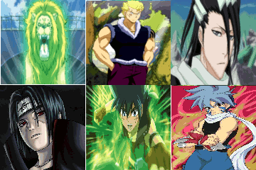
Round Two - Block C - [Synth vs. Syco]
Poll: My vote goes to ...
| Entry A |
|
25 |
| Entry B |
|
2 |
| Total: | 100% | 27 vote(s) |
Entry A
Everything is okay ..Bg is simple..Depth is missing..
Entry B
Messy! Depth and Composition are needed!
Everything is okay ..Bg is simple..Depth is missing..
Entry B
Messy! Depth and Composition are needed!
B lacks blending and composition. A is just Assassin Badassness. But well, depth is lacking. KIU! (voted for A)
i have to go with A
I'm going to go with B, since I don't really see the 'assassin' in the white hoodie thing in A as a focal... It took me a while to notice him, and B's Focal's a clear.
(This is not CnC, Just my opinions)
(This is not CnC, Just my opinions)
Both of these looked copy/paste, but A got my vote. The creator of A did a much better job making the people portrayed look like they belonged there...
This is a bit of a hard one, but I chose A.
Its more detailed, and the color is right for the theme.
Its more detailed, and the color is right for the theme.
It's hard to choose, but I have to go with A, because in B I can't really say that those are focals, because they don't pop out and add attention...
IMO, it's really easy to tell whose is whose due to the BG's
IMO, it's really easy to tell whose is whose due to the BG's
A- Amazing flow, I like how the black and white blends well with the renders, and the text has good blending, and overall this piece has amazing flow!
B- Renders don't work well together. Boring BG and virtually no flow.
My vote go's to A!
B- Renders don't work well together. Boring BG and virtually no flow.
My vote go's to A!
I have to go for A.
B, has badly rendered images and random splats everywhere. Looks horrible but still a good job!
A, next to the renders head to the right there is a kind of circle. Could've added a white soft brush to give it some lighting!
KIU!
B, has badly rendered images and random splats everywhere. Looks horrible but still a good job!
A, next to the renders head to the right there is a kind of circle. Could've added a white soft brush to give it some lighting!
KIU!
Let's get more votes up! We nearly have a day to accomplish this!
Impressed at how A incorporated 3 renders with the idea of Triple Focal that made sense, the 3 assassins. And how it was able to establish amazing flow with the three renders.
Disgusted at the irregularity of B's renders. It's triple focal, but random triple focal. If they were all in comic style, or from the movie, the overall cohesiveness would be much better.
A for Compo, Flow, Lighting but not depth.
B for nothing, really, except effort.
KIU!
Disgusted at the irregularity of B's renders. It's triple focal, but random triple focal. If they were all in comic style, or from the movie, the overall cohesiveness would be much better.
A for Compo, Flow, Lighting but not depth.
B for nothing, really, except effort.
KIU!
Entry A: Really good flow, lighting and focal point. The text actually woks well...
Entry B: Renders don't seem to be united like A, very messy and looks like it wouldn't even look good if it was in colour. No flow at all...and no lighting.
Going to have to go with A...
Entry B: Renders don't seem to be united like A, very messy and looks like it wouldn't even look good if it was in colour. No flow at all...and no lighting.
Going to have to go with A...


![[Image: gPp4aQW.png]](https://i.imgur.com/gPp4aQW.png)

![[Image: YM8un.png]](https://gfxf.net/images/2012/11/19/YM8un.png)


![[Image: kiritoxasua_tag_1_crop_awesome_by_kujikato-d8mkgbh.png]](https://orig08.deviantart.net/b598/f/2015/080/f/6/kiritoxasua_tag_1_crop_awesome_by_kujikato-d8mkgbh.png)


![[Image: scaled.php?server=211&filename=kryptonit...es=landing]](https://desmond.imageshack.us/Himg211/scaled.php?server=211&filename=kryptonitesupermangreen.jpg&res=landing)
![[Image: 381969_281635805289035_680655438_n.jpg]](https://sphotos-a.ak.fbcdn.net/hphotos-ak-snc7/381969_281635805289035_680655438_n.jpg)
![[Image: Gohan%20signature.png]](https://phototrash.yolasite.com/resources/Gohan%20signature.png)

![[Image: 8r5n.jpg]](https://imageshack.com/scaled/large/41/8r5n.jpg)
![[Image: GD34MQu.jpg]](https://i.imgur.com/GD34MQu.jpg)
![[Image: jfXbe.jpg]](https://gfxf.net/images/2012/07/13/jfXbe.jpg)