[GFX Competition Round 2] - Section Three

Poll: Vote goes to

Shido
41.67%
10
Kujikato
58.33%
14
Total: 100% 24 vote(s)
Section Three: 4 vs. 1
Face-off between: Shido and Kujikato
Theme: Mario

Shido:
[Image: Paper_Mario_GFX_Contest_Entry.png]

Kujikato:
[Image: mario_kart_infinite_speed_tag_wbo_compet...8cd1sx.png]


Vote for one!
Wow, great work Kuji; good luck!
Shido: This GFX is truly beautiful, and looks like it could be a legit Paper Mario poster. Everything goes together well, text is great, 10/10

Kujikato: Your GFX was also great, but it was very trippy to me. When I first looked at it, I thought. "Is Mario Supposed to be Upside Down?" The backround and text is great and fitting, I just didn't like the placement of the render.

In conclusion, my vote went to Shido. Great job to both of you, and good luck!
I really liked both of them...

Shido's looked excellent and well put together. The only thing I can really say bad about it is the text is kind of large. Most gfx shouldn't have large and distracting texts.

Kujikato's looked amazing. the background was great, the effects were great. Text wasn't distracting. And background flow was really nice. 10/10

That's why I voted for Kujikato.
I think he's doing a flip, desire.

Shido: looks more GameBoy-y lol. I can't tell what that thing is behind Mario. Tbh it looks like you we're try to stuff to much in there :\

Kuji: Yours looks more Wii-y. everything you do looks so detail and complex, haha. I don't really like how the text is placed, right in front of his face and the size of the text.
I voted for Shido's

Shido's:Shido had more of an old school feel,I enjoyed playing paper mario when I was younger,so it brought back many old memories for me,so I guess its a personal thing.Shidos was also less hard to look at and and didn't hurt my eyes.

Faults:For this piece I wish it had more spunk and spazaz,but not too much,Its a bit bland IMO,like mine.

Kuji:I enjoyed looking at yours a lot,which maybe why my arts hurts so much.I also like how you added the Red and Blue textures and streaks around the piece.I don't play mario cart,so I guess thats why I voted for Shido. When I see a theme picked for contest,whether its a game,show or toy,I like to feel like I'm playing/watching it.

Faults:WAY TO MUCH going on,I wished the render was a bit more focused so we would instantly know "Oh dats marioz,kewl yew!" and not "Heery Zheet,What is that? lemme focus a bit more"

Both of you did very well!
Shido:
Really has the Paper Mario theme going on! Makes it look very.. erm... Paper-Mario-ish. The only problem is that it's too crowed so the background can't be seen too much.

Kuji:
Wow. Has the aspects of the Mario Kart 8, but it gets ruined by the fact WAY too much is going on and where the text is. It would have been great, but all *that* ruined it..

I chose Shido since his represented what he was going for and was not too crowded by the background. I would have chose Kuji, but the background and text made me choose Shido Smile
What I think is the difference here is that you guys think that text should be another focal point, where as I have designed to either allow text to be the only focal point or a complimentary focal that draws the eyes to the render. The "messiness" you guys are talking about is actually just the background layering and depth. GFX isn't just take in and OK. Logos need to be like that, but GFX is more like fine wine IMO. Overall appeal (the smell) then the details and the little things that make it great (that hint of whatever flavor in the drink, etc.)


Good luck Shido!


Oh, and yeah the original render is upside down. I thought it would be a cool "spin" to it Tongue_out
Voted for Shido Smile

Kuji your work is also nice...
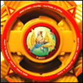
Shido: Excellent! No longer using the monotone technique with this one (it was really cool but nice to see change once in a while) The text squishes the render however, and stands out more. Imo the render should stand out more than the text and background (the background was nice and isn't distracting) Great job!

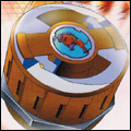
Kujikato: I like the design of the background, the text isn't distracting, but the render seems blocked out by colour effect and it's hard to see the render at first glance. The background ends up taking over the whole piece as the render is blocked out imo.

My vote goes to Shido. I really liked both but Shido's pulled through. The render wasn't mostly hidden like in Kuji's, and that's what sealed the deal. Although the text overpowered Shido's render, the effect colour in Kuji's piece made the render blend with h background and couldn't see it at all. You both did amazing, good luck!
Seeing as the poll is now closed, I assume Kujikato's now the winner. That in mind, huge congrats to him, you did very well. I wish you the best of luck in the finals. Smile
Congrats to Kuji! And also to Shido for creating a great piece of work!
The first entry felt more like a logo or forum banner more than anything and I personally did not like the white space behind the text at the bottom.

The second entry visibly looked more appealing and had more of the commonplace techniques embedded in it (fractals, C4Ds, layering, etc ...) and visually stood out as the entry with more work put into it. Although I think some of the blue dashed could be removed as it seems more cluttered, the more you look at it.

I voted for Kujikato and it looks like he wins by public nomination as well!