
I Challenge You For A GFX Battle Bey-boost
Theme: Naruto (Any Season including Gaiden)
GFX Peice : Signature
Size: Any
Date Of Submission: !7 Of January
Common Man Accept it Bey-Boost
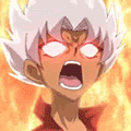
Entry A
![[Image: 399498_354517884574782_100000497200074_1...3650_n.jpg]](https://fbcdn-sphotos-a.akamaihd.net/hphotos-ak-snc7/399498_354517884574782_100000497200074_1457333_183033650_n.jpg)
Entry B
[Image: fjzy1l.png]
Theme: Naruto (Any Season including Gaiden)
GFX Peice : Signature
Size: Any
Date Of Submission: !7 Of January
Common Man Accept it Bey-Boost
Entry A
Entry B
[Image: fjzy1l.png]
![[Image: rvjzux.png]](https://i46.tinypic.com/rvjzux.png)
![[Image: 2wfnzib.png]](https://i39.tinypic.com/2wfnzib.png)
![[Image: a4wguh.png]](https://i39.tinypic.com/a4wguh.png)
![[Image: m7m1t.png]](https://i40.tinypic.com/m7m1t.png)


![[Image: YM8un.png]](https://gfxf.net/images/2012/11/19/YM8un.png)

![[Image: 8r5n.jpg]](https://imageshack.com/scaled/large/41/8r5n.jpg)
![[Image: my-1st-animated-sig.gif]](https://i1235.photobucket.com/albums/ff438/prakhar1004/my-1st-animated-sig.gif)
![[Image: zui2a9.png]](https://i56.tinypic.com/zui2a9.png)

 .
.
![[Image: di-7UY7.png]](https://gfxf.net/di-7UY7.png)
 Score count