
Critique time:
Flaming Aries: The render is not blended well. You should also try working on flow, or general direction. It is also very bland, text could be removed, and the border doesn't match the style of the sig.
ControL_s SouL_: Was this resized? Quality is very poor, but otherwise it is simple yet effective. Maybe adding a light source and touching up with the burn/dodge tool would help.
CRUelty: The render would have looked better had it been rotated to match the flow. The text should also be moved a bit higher, so none of it touches the border. A light source would be good too, usually soft brushing white, setting to overlay/soft light and lowering the opacity does the trick.
Taj12: Render and C4D quality is very poor. Text doesn't accentuate the piece and therefore is not needed. The border is too thick; remove it or make it thinner.
Sparta: The text should have been changed to a better color, like white, black, or a color picked directly from the render. The texture looks pretty bad, to be honest. Try checking DeviantArt for higher quality textures. Also, don't set your render to anything besides Normal. It usually looks bad. You have a light source, now make it shine on your render. Dodge tool or softbrushing a very light orange, then lowering the opacity/set it to overlay/soft light, on parts that come into contact with the light.
Infinite Libra: The effect you tried looks bad, to be completely honest. Random circles in the back and a bland background. Text should be removed, along with the border. Work more on lighting, depth, and flow.
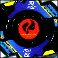
SDC: Multiple focals, not good. It looks nice for a GFX piece, but not for a tag, if you catch my drift.
Flaming Aries: The render is not blended well. You should also try working on flow, or general direction. It is also very bland, text could be removed, and the border doesn't match the style of the sig.
ControL_s SouL_: Was this resized? Quality is very poor, but otherwise it is simple yet effective. Maybe adding a light source and touching up with the burn/dodge tool would help.
CRUelty: The render would have looked better had it been rotated to match the flow. The text should also be moved a bit higher, so none of it touches the border. A light source would be good too, usually soft brushing white, setting to overlay/soft light and lowering the opacity does the trick.
Taj12: Render and C4D quality is very poor. Text doesn't accentuate the piece and therefore is not needed. The border is too thick; remove it or make it thinner.
Sparta: The text should have been changed to a better color, like white, black, or a color picked directly from the render. The texture looks pretty bad, to be honest. Try checking DeviantArt for higher quality textures. Also, don't set your render to anything besides Normal. It usually looks bad. You have a light source, now make it shine on your render. Dodge tool or softbrushing a very light orange, then lowering the opacity/set it to overlay/soft light, on parts that come into contact with the light.
Infinite Libra: The effect you tried looks bad, to be completely honest. Random circles in the back and a bland background. Text should be removed, along with the border. Work more on lighting, depth, and flow.
SDC: Multiple focals, not good. It looks nice for a GFX piece, but not for a tag, if you catch my drift.
![[Image: 1zp3yoi.png]](https://i43.tinypic.com/1zp3yoi.png)


![[Image: eminemsignew.png]](https://i1121.photobucket.com/albums/l505/spartandranzer/eminemsignew.png)


![[Image: shadowsig1.png]](https://imageshack.us/a/img194/8892/shadowsig1.png)
![[Image: 89593399.png]](https://imageshack.us/a/img443/1286/89593399.png)